Powerful Communication
Personality types in the audience
Personality types in the audience can be looked at from different spectrums. In the context of the workplace, we will look at task oriented versus people oriented personalities and personalities from high and low cultures. Understanding this aspect will help when you have presentations or webinars where you are addressing people from other cultures across the globe.
Task oriented communicators are direct and outgoing. They are impatient and want to make quick decisions. Such people want you to get to the point immediately and do not have time for the frills. When presenting to seniors in the organization or stake holders, get a sense of their personality types so that you could structure your presentation accordingly. 
The people oriented personality is a socializer and likes to achieve results working with people. As individuals, we may have a stronger percentage of any of these personalities in us, and that becomes obvious in our communication or interaction.
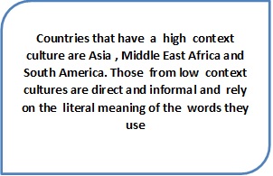
On the other hand, in today’s workplace when working across different locations, cultural adaptability and cultural competence is an absolute must. This will help you approach communication in a more patient manner. People from high context cultures are direct and formal and combine verbal and nonverbal messages to convey their views. As a listener, you may have to read between the lines to grasp the full meaning of the message. Countries that have a high context culture are Asia, Middle East Africa and South America. Those from low context cultures are direct and informal and rely on the literal meaning of the words they use. They are more free in their style, individual oriented and solution oriented. Germany and the US are countries with low context cultures.
Presentation Visuals
Visuals add an important dimension to your presentation. They include a large variety of communication products like flip charts slides video tapes etc.
When preparing visual aids a couple of pointers that you must remember are-
- a single message on a slide or page
- use simple language local photographs and examples
- use charts and graphs to support statistical information
- Be conversant with the order of the slides
Flipcharts are quick to make, inexpensive and can be prepared in advance or used to record participant comments. They are suitable for small groups only. Words and diagrams must be drawn large enough for everyone in the room to see. Use block lettering as it is easier to read and vary color for purposes of highlighting differences.
Posters are pre-prepared devices and again work well with small groups. They are permanent and portable and can be simple or elaborate. Use large lettering and vary colors again.
White boards though common and perhaps part of every presentation, lose their edge as information has to be erased often. Though they are interactive and convenient, they don’t come across as a very professional tool.
Handouts are good visual support aids and should preferably be given at the end of the session more as reference material as otherwise it would tend to distract during the course of the presentation.
PowerPoint Slides are perhaps the most commonly used visual aid, beaten to death perhaps; however, you could use it effectively.
Listed are some tips that will help you use PowerPoint effectively.
- Keep the number of slides to a minimum to keep your audience interested
- Choose a font style like Helvetica or Ariel that is easy on the eye. The font size should be such that it can be seen from the distance - a one inch letter is readable from 20 feet
- Use short points and bullet points for your sentences
- Use graphics however don’t overdo them
- Keep slide backgrounds subtle and consistent. Don’t add to much animation which can be distracting
- Use high contrast between your text color and background color
- Check the presentation for any kind of errors
- Verify that the projector’s resolution is set to the same resolution as that of your presentation
- Bulleted items should not be smaller than 22 points.
- The title should not be smaller than 28 points.
- Use images sparingly
- Align text to the left
Use color schemes in a manner that the slides appear pleasing and easy to read and are not hurtful to the eye. Light backgrounds, dark texts, lots of white space, all help give a professional look to the presentation.
If you were designing a PPT and feel confused , wondering what information needs to be presented on the slides, think over this:
In the introduction use the slides to display the name of your presentation, define particular terms, indicate a structure or highlight a question.
In the body of the presentation, slides could be used to highlight new main points, graphs or charts to support data or show sequence by linking points together.
In the conclusion, use a PPT to summarize the main points, a visual to encompass the presentation or to show key references. Planning in this manner helps you to limit the number of slides to just the bare essentials.
Summary:
- Is your audience from a high context culture or low context culture?
- Flip charts, posters, white board, handouts, Power point presentations - what will be your visuals of choice?
Reflection Time
You have to review a PPT made by Shailesh, the newest member of your team. These are some of the observations. Comment on them and explain to Shailesh why it is not appropriate to do so.
- The background color is deep blue
- The font used is Algerian size 20
- Text color is red
- Almost 10 lines of information on each slide
- Audio animation for change of frames
Copyright (c) Infosys BPO Limited and/or its licensors, 2014, all rights reserved